
Designing MICA for low-bandwidth realities
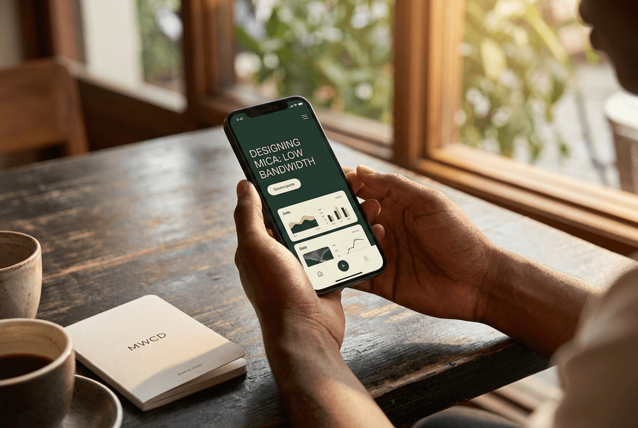
A lot of mental health technology is built and tested in places with dependable broadband, then quietly assumes that experience is universal. It isn't. Across many of the communities MICA is being built for, connectivity is intermittent, data is expensive relative to income, and a lower-end device with limited storage is the norm rather than the exception. If we built for the demo environment instead of the real one, we'd be building something people simply couldn't use.
So the brief for MICA inverted the usual priorities. Instead of asking "what features can we fit in", we asked "what's the smallest, lightest version of this that still does something real". Mood tracking and journaling load and save locally first, syncing quietly whenever a connection is available, rather than requiring one to function at all. Every screen is designed to be legible and useful even when images and richer content haven't finished loading.
This shaped decisions that never show up in a features list. We chose simpler, smaller illustration assets over the more elaborate versions we originally designed. We built the AI check-in to work meaningfully on a poor connection instead of assuming a constant one. None of that is exciting on a slide, but it's the difference between an app that works for the person it's meant for, and one that only works for the person demoing it.
We'd rather MICA be a little less flashy and genuinely usable on the phone someone actually owns, in the place they actually live, than beautiful in a pitch and useless in the field.